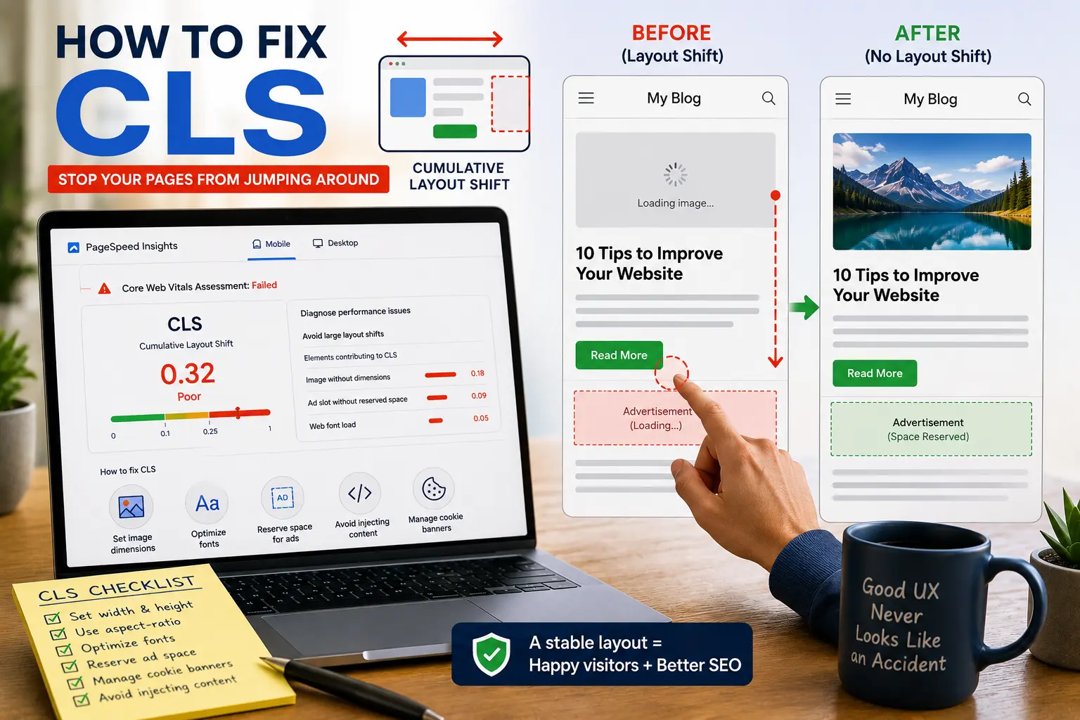
Cumulative Layout Shift (CLS) is a Core Web Vital that measures how much visible page content unexpectedly moves while a page loads. A good CLS score is 0.1 or lower, and fixing it improves user experience and can help SEO. The problems are visible. You can see them happening. And most fixes are straightforward once you understand why the page is shifting.
CLS is the most annoying Core Web Vital. Not the hardest to fix. The most annoying.
Everyone has experienced it. You're reading an article. The page seems loaded. You find the paragraph you were on. Then an image loads above it and shoves the text down. You lose your place. You scroll back up to find where you were. You mutter something under your breath.
Or worse. You're about to tap a button. An ad loads above it. The button moves. You tap the ad instead. That's CLS in action. And it's probably costing you conversions without you even knowing. The visitor didn't bounce because your content was bad. They bounced because your page physically fought them while they tried to use it.
It's not a speed problem. It's a stability problem. A fast page can still jump around.
What Is Cumulative Layout Shift
Cumulative Layout Shift measures how much your page layout shifts while loading.
Google calculates a score based on how much of the viewport moves and how far it moves. A score of 0 means nothing shifted. A score of 1 means the entire visible area shifted. The scores are usually small decimals. You'll see numbers like 0.05 or 0.23.
| CLS Score | Rating |
| 0 to 0.1 | Good |
| 0.1 to 0.25 | Needs Improvement |
| Above 0.25 | Poor |
These numbers seem tiny because they represent fractions of the viewport. A score of 0.1 means about 10 percent of the visible area moved. That's noticeable. You've felt it.
CLS isn't just about whether things move. It's about how much they move and whether the movement was unexpected. An animation that you triggered by clicking a button doesn't count. Content that shifts because an image loaded without reserved space does count. The distinction matters. Intentional movement is fine. Surprise movement is what Google measures.
Our Core Web Vitals guide covers how CLS fits alongside LCP and INP.
How to Find What's Causing Your CLS
PageSpeed Insights is your starting point. Run a test on your URL. Look at the CLS section. It tells you your score and often identifies which elements are causing the shifts.
Scroll down to the Diagnostics section. Look for "Avoid large layout shifts." It lists the specific elements that shifted and how much they contributed to your score. This is the most useful diagnostic information. It tells you exactly what to fix. Instead of guessing, you know which image or which ad slot is the problem.
Open the page yourself. Load it on a slow connection. Chrome DevTools has a network throttling option. Set it to "Slow 3G." Watch the page load. See what jumps. See what pushes content around. The visual experience tells you more than the numbers. You'll catch things the lab test misses. Chrome DevTools' Performance panel can also highlight layout shift regions, making it easier to identify exactly which elements are moving.
Check different page types. Your blog posts might be fine while your product pages are terrible. Your homepage might shift on mobile but not on desktop. Test multiple pages. Test multiple devices. CLS is often template-specific. Fix it in the template and all pages using that template improve.
Our free SEO checker identifies CLS issues alongside other technical problems.
Set Dimensions or Use CSS aspect-ratio on Images and Videos
This is the most common CLS fix. And the easiest. I'd guess it solves maybe 70 percent of CLS problems on content sites.
When a browser loads a page, it starts rendering content before images finish downloading. If you don't tell the browser how big an image is, it assumes the image has zero height. The text fills the space where the image will eventually appear. Then the image loads. It takes up space. Everything below it gets pushed down. That's layout shift. You've seen it. You've been annoyed by it.
The fix is adding width and height attributes to every image tag. Modern browsers reserve layout space automatically when width and height attributes or the CSS aspect-ratio property are present. The browser knows the dimensions before the image loads. It reserves the space. When the image finally downloads, it fills the reserved space. Nothing moves.
Most modern browsers also use these attributes to calculate the aspect ratio automatically. Even if CSS overrides the display width with max-width: 100% or similar, the browser still knows the proportions and reserves the correct vertical space. This works in Chrome, Firefox, Safari, and Edge.
For CSS-based responsive layouts, you can also use the aspect-ratio property directly. Something like aspect-ratio: 16/9 on an image container tells the browser the proportions before the image loads. Same result as width and height attributes. Different approach. Useful when you can't control the HTML attributes directly. Google increasingly recommends using aspect-ratio for modern layouts.
For responsive images, the srcset and sizes attributes let you specify different image sizes for different screen widths. Smaller images for mobile screens load faster, and combined with proper dimensions, they prevent layout shifts across devices. Converting large PNG files to WebP or AVIF won't directly reduce CLS, but smaller images load faster and help improve overall Core Web Vitals when combined with proper dimensions.
Lazy loading images improves loading performance, but images above the fold should generally load immediately. Combining lazy loading with proper width and height attributes prevents both slow loading and layout shifts. Never lazy load the hero image. That's your LCP element and it needs to appear immediately.
This goes for videos too. Embeds from YouTube. Vimeo. Self-hosted videos. All of them need dimensions. For responsive embeds, use the aspect-ratio CSS property or the padding-bottom trick to reserve space that scales with the container width. The padding-bottom approach is older but still works everywhere.
The same applies to iframes. Calendly embeds. Google Maps. Embedded forms. Third-party widgets. Any iframe that loads asynchronously and takes up space needs reserved dimensions. Without them, the iframe loads after the page renders and pushes everything down.
If you're using WordPress, most modern themes handle image dimensions automatically. But check. Some page builders strip the attributes. Some lazy loading plugins remove them. View your page source. Look at your image tags. If they don't have width and height, add them. It's tedious but it works.
Our image SEO checklist covers image optimization including dimension attributes.
Reserve Space for Ads and Embeds
Ads are the worst CLS offenders. You don't control what size ad appears. You don't control when it loads. The ad network sends whatever it wants and your page shifts to accommodate it. The visitor blames your site. Not the ad network.
The fix is reserving space. If your ad slot is 300 by 250 pixels, reserve a 300 by 250 pixel container. Even if no ad loads, the space is there. The page doesn't shift. If a smaller ad loads, it fills part of the reserved space. If a larger ad tries to load, it gets constrained or hidden. The page stays where it was.
For Google AdSense, set a fixed size for your ad units. Use CSS min-height on the ad container. If the ad network sometimes sends smaller ads, the container stays the same size. The page stays stable. You might have an empty-looking space if no ad fills it, but the tradeoff is worth it. Better an empty space than a page that attacks the visitor.
For embedded content like tweets, YouTube videos, or maps, same principle. Reserve the space before the embed loads. Most embed codes include dimensions. If they don't, wrap them in a container with fixed dimensions or aspect-ratio. The space is there. The embed fills it when it loads. No shift.
This is harder than fixing images because you don't always know the ad size in advance. But even approximate space reservation reduces CLS significantly. A container that's roughly the right size is better than no container at all. The shift goes from "entire page moves" to "small adjustment inside a fixed box."
Cookie Banners and CLS
Cookie consent banners deserve their own section because they're one of the most common CLS issues I see. Especially on WordPress sites, Shopify stores, and any GDPR-compliant website.
The problem is predictable. The page loads. Content appears. Then the cookie banner loads a moment later. It pushes the entire page down. The user loses their place. Every element below the banner shifts. CLS spikes.
The fix depends on your banner implementation. The best approach is to reserve space for the banner in the initial layout. If your banner is 80 pixels tall, leave an 80-pixel gap at the top or bottom of the page. The banner fills that gap when it loads. Nothing shifts.
If your banner appears as an overlay instead of pushing content, that's usually fine. Overlays don't cause layout shifts because they don't affect the position of other elements. The content stays where it was. The banner floats on top. No CLS impact.
If you can't control the banner positioning, at least make it load immediately. Don't defer it. Don't load it after a delay. The sooner it appears, the less likely it is to shift content that the user has already started reading. Put the banner script early in the page head. Make it render before the main content.
Some cookie consent plugins are better than others. If your current plugin is causing CLS, try a different one. There are dozens of options. Some are designed with Core Web Vitals in mind. Others clearly aren't.
Fix Font-Related Layout Shifts
Web fonts cause CLS because they load after the page starts rendering.
The browser starts showing text using a fallback system font. The web font downloads. The characters are slightly different sizes. The text reflows. The page shifts. It's subtle but it adds up across the page. A sentence wraps differently. A heading takes up an extra line. The content below moves.
The easiest fix is using font-display: optional in your font-face declaration. This tells the browser to use the web font if it's already cached, but skip it if it would cause a layout shift during the initial page load. The tradeoff is that some users might see the fallback font instead of your branded font. For most sites, that's acceptable. A consistent reading experience matters more than a consistent font.
Preloading fonts helps too. Add a <link rel="preload" as="font"> tag in the page head. The browser downloads the font early. It's more likely to be available before the page renders. Less chance of a layout shift. Include the crossorigin attribute for font preloads or they won't work.
Matching fallback font metrics to your web font metrics reduces the shift when the web font does load. Tools like Fontaine and Font style matcher help you find fallback fonts that have similar size and spacing to your web fonts. If the fallback and web font take up similar space, the shift is minimal or nonexistent. The text reflows imperceptibly instead of jumping.
Self-hosting fonts instead of loading from Google Fonts or other services can help too. The fonts load from your server or CDN. The connection is faster. The font downloads sooner. Less time for a layout shift to occur. It's one less external dependency.
Don't Insert Content Above Existing Content
This one is more about behavior than technical setup.
If something loads above the current viewport, everything below it gets pushed down. An email signup form that slides in from the top. A notification bar that appears after the page loads. A chat widget that expands. Anything that adds space above content the user is already looking at.
The fix is simple. Don't do that. If you need to add content dynamically, add it below existing content. Or overlay it. Or reserve space for it so the shift is accounted for. Your visitors came for your content, not for a form that interrupts them.
If you absolutely must insert content above existing content, trigger it based on user action, not automatically after a delay. If the user clicks a button and a form appears above, that's not a CLS issue because the shift was caused by user interaction, not by the page loading unexpectedly. Google doesn't penalize user-initiated shifts.
For notification bars and banners, reserve space for them in the initial layout. A 50-pixel-tall bar at the top of the page. Even if no notification shows, the space is there. When a notification does appear, it fills the reserved space. No shift. You're trading a small empty space for layout stability. Worth it.
Animations That Don't Cause CLS
CSS animations can cause CLS if they change layout properties. Animations that modify width, height, top, left, or margin trigger layout recalculations. The browser has to figure out where everything goes again. Other elements move. CLS increases.
Use CSS transform and opacity for animations instead. Transform moves elements visually without affecting the layout. The element appears to move, but other elements don't shift because the space the element occupies doesn't change. It's like moving something in a video. The underlying structure is unchanged.
For example, instead of animating top or left to slide something in, use transform: translateX() or translateY(). The visual result is the same. The layout impact is zero. Instead of animating width to expand something, use transform: scaleX(). Same appearance. No layout shift.
If you're using an animation library, check the documentation for performant animation options. Most modern libraries default to transform-based animations. Some older ones don't. A library that seemed fine a few years ago might be causing CLS now.
CLS Issues from Third-Party Scripts
Third-party scripts cause CLS in ways that are harder to fix because you don't control the code. But you can contain the damage.
Live chat widgets. They start collapsed. The user clicks. It expands. If it pushes content, that's acceptable because the user triggered it. If it expands automatically after a few seconds, that's a CLS problem. Configure the widget to only activate on user interaction. Not on a timer.
A/B testing tools. Some tools modify the page content after loading. They hide the original element. Show the variant. If the variant has different dimensions, the layout shifts. Test your experiments for layout stability before launching them. A test that improves conversion but destroys CLS might not be worth it.
Analytics and tracking scripts. These rarely cause CLS directly. But they load before other resources and can delay the rendering of the actual page content. Async and defer attributes help. Load analytics in the background. Don't let them block the page.
The general approach with third-party scripts is containment. Give them a fixed container. Let them do whatever they want inside that container. The page layout stays stable even if the third-party content misbehaves. It's like putting a fence around something unpredictable.
CLS on Mobile vs Desktop
CLS is usually worse on mobile. Smaller screens mean shifts take up a larger percentage of the viewport. A 50-pixel shift on a 1024-pixel screen is about 5 percent of the viewport. The same 50-pixel shift on a 375-pixel phone screen is over 13 percent. More than double the impact.
Test on mobile viewports specifically. PageSpeed Insights shows separate scores for mobile and desktop. Chrome DevTools has device emulation. Test on a simulated phone screen. Load pages on a throttled connection. See what jumps. Desktop might look clean while mobile is a mess.
Mobile ads are often larger relative to the screen than desktop ads. A 300x250 ad on a desktop page is a small box. The same ad on a mobile page might fill half the screen. When it loads late, the shift is massive. Consider different ad sizes for mobile. Smaller ads. Fewer ads. Ads that fit the screen.
Responsive images help on mobile. Serving appropriately sized images for the viewport means images load faster and dimensions are more predictable. The <picture> element and srcset attribute let you specify different image sizes for different screen widths. Smaller images for mobile screens. Larger images for desktop. Faster loading. More predictable space reservation.
How to Test If Your CLS Fixes Worked
The lab test is immediate. Fix something. Run PageSpeed Insights again. The CLS score updates instantly. Don't worry if Google Search Console and PageSpeed Insights show different CLS values. One uses real user data while the other uses a lab test. This is the fastest feedback loop in Core Web Vitals optimization. You know within seconds whether the fix worked.
Many site owners fix CLS, rerun PageSpeed Insights, see a green score, then wonder why Google Search Console still reports a problem. Google Search Console's Core Web Vitals report uses real user data over the previous 28 days. Fixes today won't show up in field data for up to a month. Don't panic if Google Search Console still shows yellow after you've fixed everything. The old data has to age out. Check back in four weeks.
Test across multiple pages of the same type. If you fixed CLS on one product page, test a few other product pages. The fix might be template-level or page-specific. You want to know which. Fix it in the template if it's template-wide. Fix it on the page if it's page-specific.
Test on real devices if you can. A lab simulation is good. Real hardware on real network connections is better. Borrow a friend's phone. Test on your own phone over cellular data. See how the page actually behaves in the wild.
Our core web vitals checklist covers testing methodology in more detail.
Common CLS Fix Mistakes
A few things I've seen go wrong. I've made some of these myself.
Setting dimensions on images but getting the aspect ratio wrong. The image is 1200x800 but you set width="800" and height="1200". The reserved space is the wrong shape. The image loads and either gets distorted or the space readjusts. Double-check your dimensions. Look at the actual image file.
Reserving too much space for ads. A 300x600 ad slot on a mobile page takes up a huge amount of room. If no ad fills it, you have an awkward empty space. Size your ad slots appropriately for each device. Mobile slots shouldn't be desktop-sized.
Forgetting about dynamically loaded content that's different on each page load. If your recommendation widget loads a different number of items each time, the space needed varies. Reserve enough space for the maximum possible content. Or load the content server-side so it's in the initial HTML and the browser knows the exact size from the start.
Fixing images but forgetting videos and embeds. Same problem. Same fix. Dimensions on everything that takes up space. YouTube embeds. Tweets. Maps. Calendly widgets. Embedded forms. Anything that loads asynchronously and takes up space.
Fixing the homepage but forgetting interior pages. The homepage is usually the worst CLS offender. But blog posts and product pages can have their own issues. Check multiple page types. Fix the template. Not just one page.
CLS isn't about making your site faster. It's about making it feel stable. When visitors can read, scroll, and click without the page unexpectedly moving, the experience improves immediately. Fortunately, most CLS issues come down to a handful of predictable problems that can usually be fixed in a single development session.
Start with images. Set width and height attributes on every image and video on your site. This fixes the majority of layout shift problems. It's boring. It's tedious. It works. You'll probably find images you forgot to fix for weeks afterward. That's normal.
Then tackle fonts. Use font-display: optional or preload your web fonts. The shift from font loading is subtle but Google Search Console notices it. It's one of those things you don't see but the metrics catch.
Then handle ads, embeds, and cookie banners. Reserve space for them. Give them containers with fixed dimensions. Don't let them push your content around. If your cookie banner is causing CLS, switch to an overlay or reserve space for it. Avoid injecting ads above content that users are already reading.
Test on mobile. CLS is always worse on small screens. A shift that's barely noticeable on desktop can be terrible on a phone. Mobile-first testing catches the worst problems.
And if your CLS is already under 0.1, stop. You're in the green. Go fix your LCP or INP instead. Those are probably worse. There's always another Core Web Vital that needs attention. But CLS is usually the easiest one to check off the list. Get it green and move on.